Ticketmaster Event Concept
- 3
This project was born from a few different aspects of my life colliding: I was trying to come up with a UX/UI project to familiarize myself with Adobe XD, and I was also buying BTS tickets on Ticketmaster.
Process
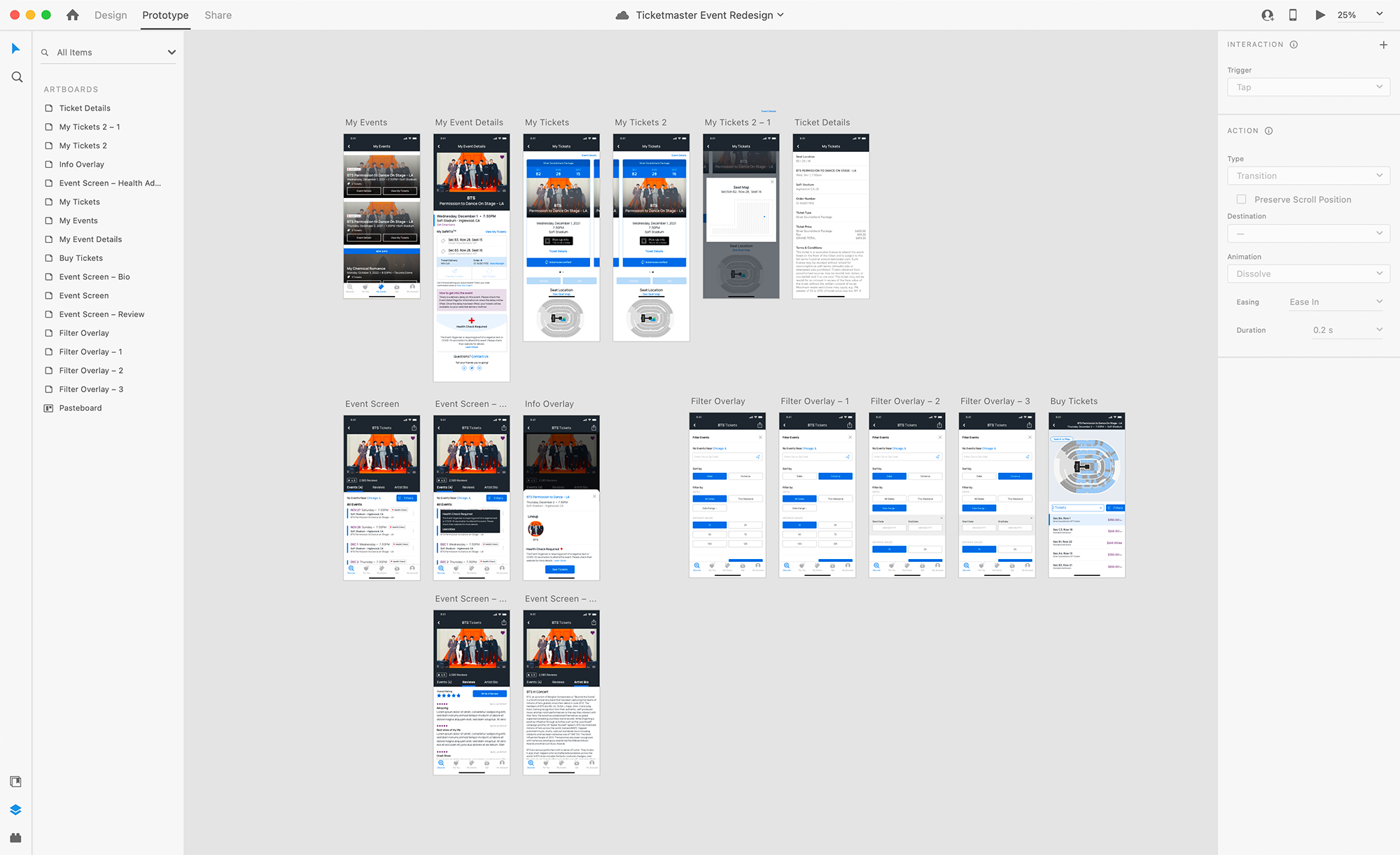
I started out by going through the app and comparing what was available on the website, then made notes of what I wanted easier access to. My goal with this project wasn’t to redesign Ticketmaster, just to reimagine some of the pages, make hierarchical changes, and find ways to incorporate features I wish the app had.
Artist Search
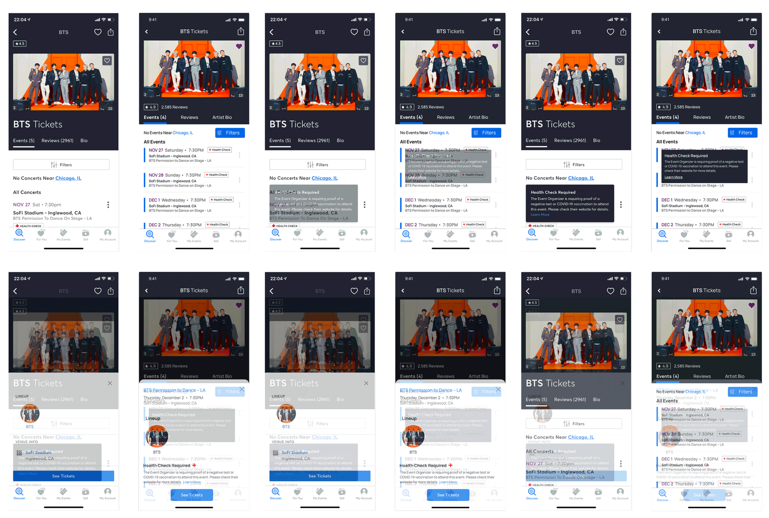
I decided to start with the artist search page and build out from there. I tried to shorten the header section up by making some hierarchy changes and grouping things that I felt were similar. I also brought in more of the Ticketmaster blue to help draw attention to the filters button since I made it smaller, as well as to help break up the event listings.
I really felt that the ellipses menu for each event is being underutilized currently, so I tried to include more information about which event was clicked into as well as any notices that buyers should be aware of.
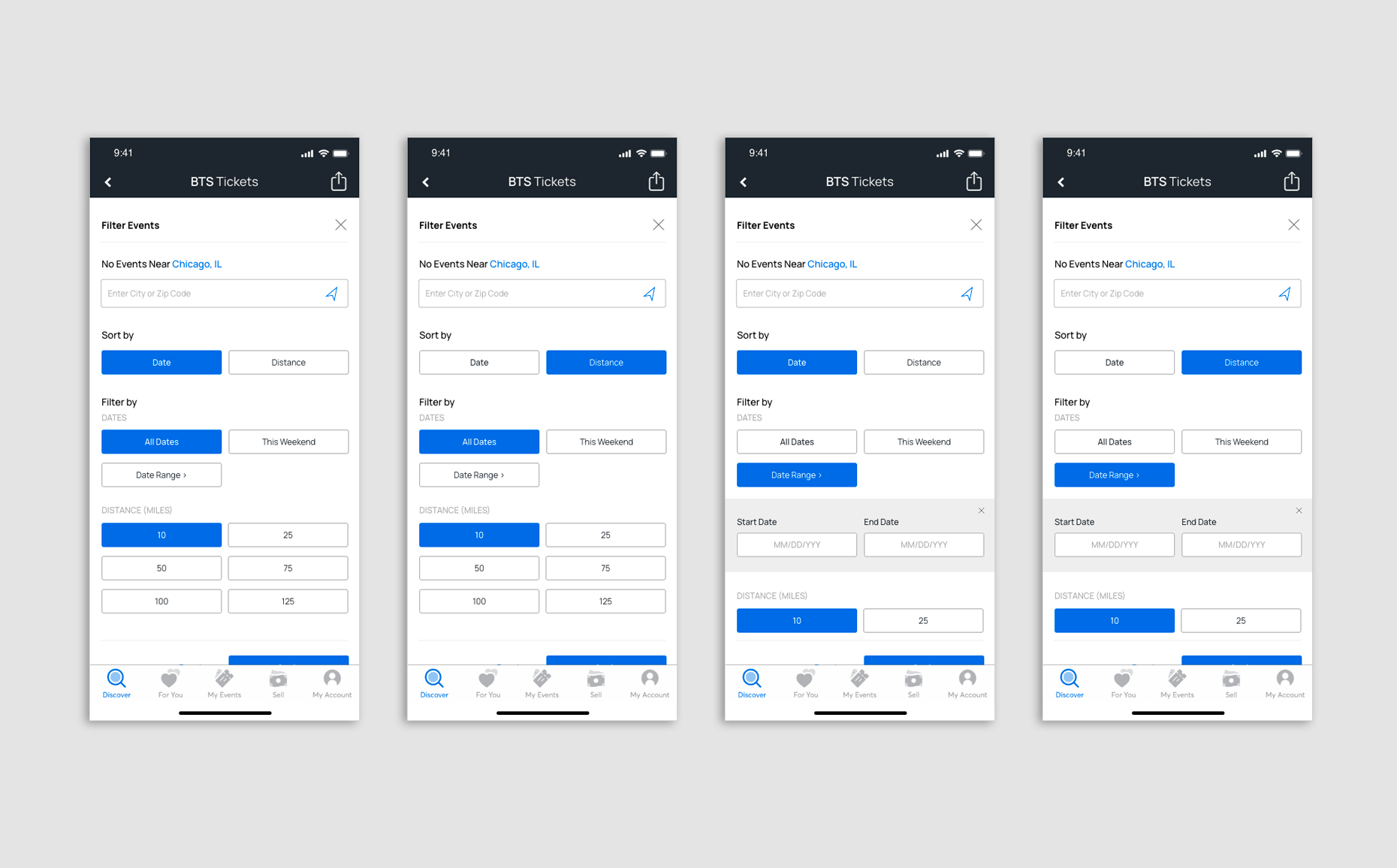
I made minimal changes to the event filters overlay. Currently, there is no option to adjust the location search from inside the filters search, but there is the option to sort results by distance so adding the option to change the location feels proper. I also condensed the date range drop-down. The filter screens were largely for prototyping practice and seeing how to move between screens and show interactivity.
My Events
The event and ticket sections are honestly what made me want to try this project. In the Ticketmaster app the My Events tab of the menu will bring up a basic screen of events the user has tickets to, which then opens up to a screen that’s mostly for checking seat numbers and accessing your ticket barcode at the time of the event. This is really useful for easy access to your tickets at the event, but I honestly like the extra Event Details page that I had access to when using the website. I didn’t want to make accessing tickets any more difficult in the app, but I did want to include that additional page.
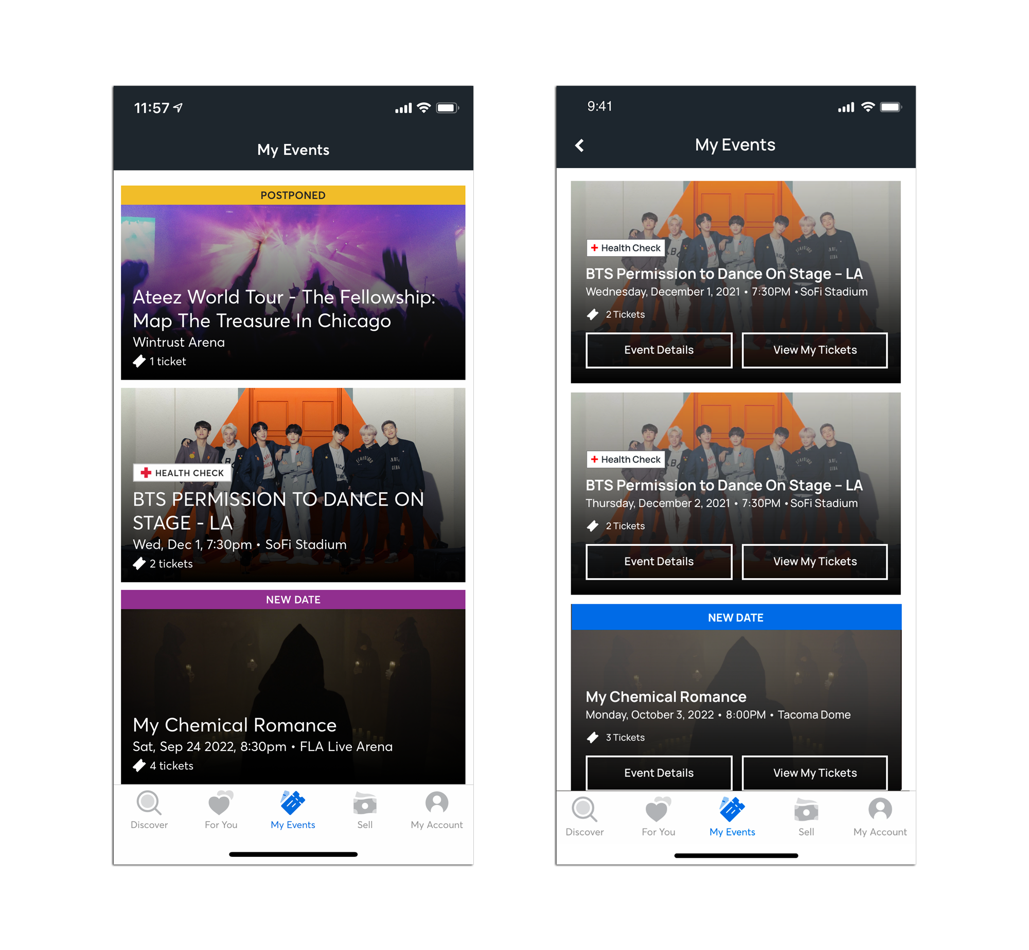
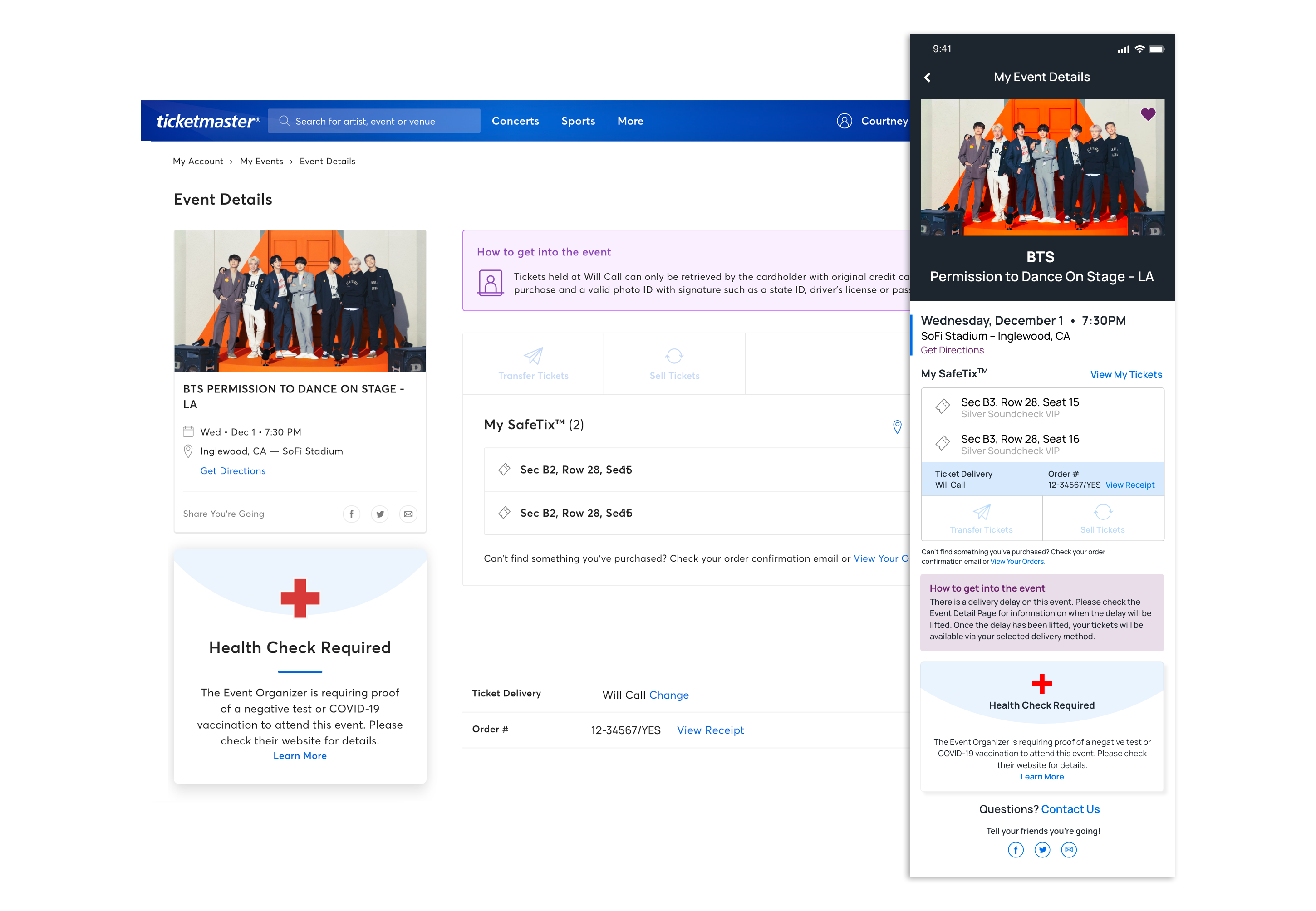
Event Details leads to the screen above that has event info, directions to the venue, and the share feature.
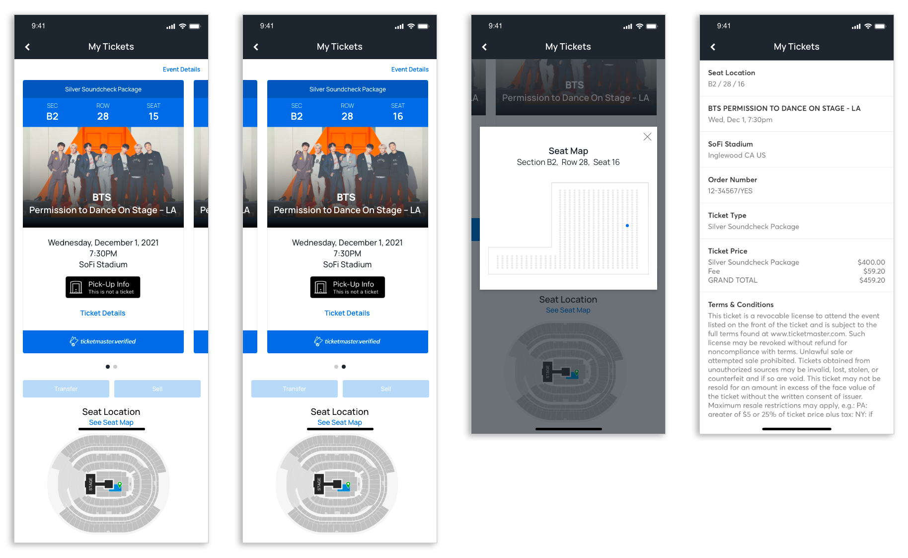
View My Tickets leads to the current ticket screen, with the inclusion of being able to scroll down and see the seat location. Currently, the seat location image isn’t visible in the app, only if a user checks on the website, and that’s something I’ve always wanted easier access to. Clicking See Seat Map brings up an overlay with a more detailed view of the seat section, with the seat highlighted. This is a feature I really wanted to find a way to include, as there’s no way to see a specific seat location in a detailed way after purchasing a ticket.
